Wednesday 27 January 2016

Saul Bass

Saul Bass


Saul Bass was an American graphic designer who became famous for his title sequences.
He is best known for his use of simple geometric shapes and symbolism he often created a single dominate image to stand alone to convey an influential message.
Bass started out designing posters; he was able to capture the mood of the film with simple shapes and images. He preferred this technique then using dull photographs from the film or using the film stars. 
Bass's work is often hand drawn to create a casual appearance and unique look.


Bass worked for some of Hollywood’s greatest filmmakers, including Alfred Hitchcock, Stanley Kubrick, Otto Preminger, Billy Wilder, and Martin Scorsese. He became well-known in the film industry after creating the title sequence for Otto Preminger’s The Man with the Golden Arm in 1955. For Alfred Hitchcock.

“I began as a graphic designer and as part of my work I created
many film symbols for ad campaigns. During that period I happened to be working on the symbols for ‘Carmen Jones’ and ‘The man with the golden arm’ for Otto Preminger. At one point in our work Otto and I just looked at
each other and said: “why not make it move?” It was really as simple as that.”


— SAUL BASS – “Bass on titles,” 1977


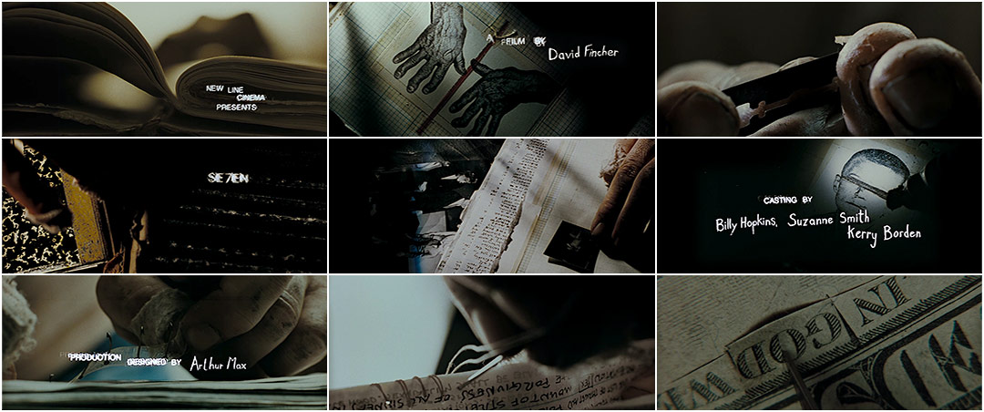
Se7en


     Kyle Cooper created the title sequence for the 1995 film Se7en dir (David Flincher), he              changed the whole movement of title sequences and influenced many other graphic                      designers when it was released. Cooper sets the mood of the film straight away with the              gritty and eerie music which emphasizes the thriller genre.

     The close up shots creates a claustrophobic feel to make the audience uncomfortable but also        forces them to look at the smaller details on the screen and what you wouldn't necessarily            look at also on what the character is doing such as what hes highlighting, titles of                
     newspapers and photographs. It also makes the audience think on who the character is, what        hes doing and why hes doing it.


The close up of the dirty hands shows that he does a lot of manual work as which also makes the audience uncomfortable as the character is using a razor to peel of the skin which isn't classed as a normal thing to do. Also when the perpetrator is suing the book it also makes the viewers fear the needles and reminds them of stitches. The props are books, journals and files which can be associated with investigation and detectives which gives the audience on what the film could be about.
The colours are neutral such as black and white but when it goes further into the sequence bits of red show up and when photographs are getting developed in a dark room which means he had taken them himself. The colour red also represents danger and power.
The font in the sequence when showing the actors names is childlike which can represent the perpetrator with mental disabilities to show an innocent side of the character but with it being shaky it also represents his manic and unbalanced mind.


 OCR
Preliminary exercise: Continuity task involving filming and editing a character opening a door, crossing a room and sitting down in a chair opposite another character, with whom she/he then exchanges a couple of lines of dialogue. This task should demonstrate match on action, shot/reverse shot and the 180-degree rule.

Main task: the titles and opening of a new fiction film, to last a maximum of two minutes.

All video and audio material must be original, produced by the candidate(s), with the exception of music or audio effects from a copyright-free source. Both preliminary and main tasks may be done individually or as a group. Maximum four members to a group.

Wednesday 13 January 2016

Continuity Sequence


This is Short clip has match on action , shot reverse shot and 180 degree shot. To improve this clip we could of had the camera in focus more and have the camera not so shaky