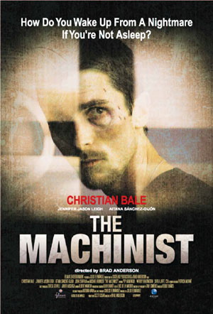
Thursday 7 April 2016

Journal-Sound


We researched music to go with our title sequence because our genre is thriller we are going to need a slow and eerie soundtrack to create a creepy atmosphere.
As a group we decided to add an audio to our sequence influence from the Gone Girl sequence. We choose to have one of our group member to say a few sentences from the Brothers Grimm story Hansel and Gretel as it links to our narrative of the missing boy this is effective because it adds suspense and tension towards the audience.


Journal


When planning to reshoot the scenes of the attic and looking through the evidence we needed a really dark room so we booked out the schools drama room as its all black which is perfect on what we needed. We decided that having just a spot light on the protagonist and props will draw the audience and will make no distractions but also gives it a more creepy and thriller look.

Journal-Cinematography


From our feedback we decided to remove the montage of arrows and road signs as it didn't go with the sequence as we was told it was random and didn't go with the narrative of the title sequence. So instead of road signs we changed it to the main character planning her journey for looking her missing brother we shown this by having maps, train times and tickets. These shots are much more successful as its more clear on whats going on. I filmed the protagonist writing the train times and a close up of her looking and drawing on the map then i filmed all the props together by moving the camera in one smooth motion showing the audience the props then the camera ending on the picture of the missing boy.


Wednesday 6 April 2016

Title Sequence final cut

Evaluation 5

Looking back to your preliminary task, What do you feel that you have learnt in the progression from it to the full product? 

I have learnt a lot throughout the making of our title sequence. As i choose to do cinematography i learnt about different kinds of camera shoots and angles and when framing the shot. I have learnt about the media industry such as distributing, audience demographics and analyzing title sequences which has expanded my knowledge on this subject. I also got a chance to use Final Cut Pro when making the production title i found that this was very useful as i have now got the hang of it so next time when it comes to using it i can make quality work on Final Cut Pro.
I also learnt on how to use and make stop motion on our typography and how to import and edit it. I think the stop motion is the best aspect in our title sequence because it brings the whole sequence together and gives it a mysterious look.

I also learned a lot about the codes and conventions of the thriller genre which helped make our sequence, such as sound we had to research a lot on sound as it took time to find the right sound that went with the sequence but finally we did. We had to download and import a lot of sounds as we couldn't use copyrighted music which also made it even more harder.

I have learnt on how to communicate and express my ideas more to my peers. So working together was an easy thing and sharing ideas to help better our final cut of our title sequence. We also learnt about time management by working in our free periods and after school to finish our work to the best of our ability. 

Evaluation 5


Evaluation 4


Evaluation 3


How did you attract/audience your audience?

The use of Star power helps attracts certain audiences as our main protagonist is a teenager. So we choose the actress Kristen Stewart as she is a role model for many teenagers and has a pre established fan base from the known film Twilight.
Casey Affleck would also bring in audiences who like a variety of different thriller genres as he has been in multiple films such as Gone baby Gone, Out of the furnace and The killer inside me.
Jacob Trembley has also been in thriller film and also just recently been in a nominated Oscar film.

Social media is the way we marketed our film. This is the best way as everyone is on social media nowadays. Teenagers are mostly the ones on social media so it will attract them to watch the film. The film has a better chance on being successful if its on social media as it will get people talking and the actors can promote it on their twitter,Facebook accounts which will create an even bigger  audience.


Evaluation 2


http://prezi.com/ccmetpzsdgzc/?utm_campaign=share&utm_medium=copy

Tuesday 5 April 2016

Evaluation 1

•    In what ways does your media product use, develop or challenge forms and conventions of real media products?

       When deciding that our genre would be thriller we researched the codes and conventions in the thriller genre. We followed the codes and conventions by using close up shots to show emotion in the mannerisms of the protagonist. Our title sequence was overall quiet dark as we only had a spot light on antagonist which creates mystery, not showing the antagonist face also follows the conventions as it creates tension and enigma, the shots were also cut quite fast paced which follows the conventions of thriller. The music we used builds tension and more suspense this is effective because its keeps the audience interested. The montage makes it clear that we are reopening a investigation case by the props we used such as detective cards, police evidence files and missing posters this follows the conventions of the thriller themes as most thrillers have involvement with detectives. The stop motion typography was handwritten which was very effective as it looks like they could be notes or clues the audience can interpret as either. 

Monday 4 April 2016

Journal


http://www.bensound.com/royalty-free-music/cinematic
https://incompetech.com/music/royalty-free/

It took us some time to find the right soundtrack for our title sequence. We found fast paced music to go with the sequence and also to move it along and make it not drag. We found a soundtrack of nursery thyme as it goes with the narrative and audio in the begging.We found our other music on http://www.bensound.com/royalty-free-music/cinematic and downloaded them to iTunes before transferring them to final cut pro.


Sub-Genre


Sub-Genres

The Thriller genre is split into different sub-genres to describe the type of thriller film each one is.


Psychological- Psychological thrillers focus on the mental and emotional state of the characters. It also plays on the audiences minds by using enigma which produces suspense in the film as it reflects on the characters mentality. Mystery and crime are often incorporated into the psychological genre. The 2010 film Shutters Island Dir. (Martin Scorsese) is an example of psychological sub-genre.


Political- Political thrillers normally include the main protagonist ensuring the stability of the government. Political corruption,terrorism and warfare are common themes of political thriller. The 2012 film Argo Dir.(Ben Affleck) is an example of Political thriller.


Spy- Spy thrillers mainly have elements of action. Spy films usually use government agencies as the main base of the film. Spy thrillers usually focuses on the main protagonists travel and adventures of either escapism or revenge. Sometimes spy thrillers have a combination of the genre of action and science. The 2002 film The Bourne Identity Dir.(Doug Linman) is an example of spy thriller,


Crime- Crime thrillers focuses on the criminals of the crime rather then the actual law. The main topics of crime thrillers are often about murder, killers, heists and robberies. The 2006 film The Departed Dir.(Martin Scorsese) is an example of crime thriller.


Audience Profile


Feedback

Journal


Sound

Sound is important in every sequence as it creates the mood of the film. Sound is to help create tension with eerie or intense music being played in the background. High pitched sound is often used as it makes the audience uncomfortable it also shows that something unpleasant is going to happen. For example the 1958 film Vertigo Dir (Alfred Hitchcock). In this title sequence the sound is high pitched throughout creating suspense and making the audience uneasy as its also repeated over and over again along with the Saul Bass geometric shapes that also repeat so it makes everything seem never ending.

Vertigo- https://youtu.be/4CZfSc6nJ8U

In thriller it is also common to use add dialogue or inner monologues to the sequence as it creates enigma but also narrative which could link to the film further on. It also creates more direct tension towards the audience as it seems like they are experiencing the the film from the characters point of view.

Gone Girl monologue- https://youtu.be/vyYkttbnPK0


influences

Gone Girl

We are taking influence from the 2014 mystery thriller film Gone Girl Dir.(David Flincher)  Because our film idea is about an old case being reopened of a missing boy. We will be showing this through our title sequence by having props such as missing posters, clips of the news report, montage of locations.
In Gone Girl there is a scene in the beginning of the film of a persons speaking about the protagonist with an extreme close up shot of her. We are going to use the idea of an audio telling a narrative at the beginning of our sequence to add enigma.
In the Gone Girl montage there are locations of the city in the film, the shots have been filtered with a blue tint this creates a sinister mood.
In our title sequence we have decided to add a montage at the end with it including road signs such as arrows to represent her journey, signs of locations and maps of the area.

The typography is faded onto the screen and is placed on the bottom of the screen, the colour of the font it white it stands out from the shots which changes the viewers eyes to the text to read but as its also small


Thursday 31 March 2016

Analysis of sequences following codes and conventions


The Machinist

The title sequence of the 2005 film The Machinist Dir( Brad Anderson) follows the codes and conventions of the thriller genre. At the beginning of the sequence we see a black screen with the text of the film company but we hear the sound of a pant or someone struggling to breathe this already makes to the audience uneasy as they don't know where its coming from or who it actually is.

The soundtrack is mainly digetic in the sequence, the music is ominous and creepy which creates a thriller atmosphere. Danger is foreshadowed as there are digetic police sirens playing at the beginning of the scene.
As the audience we are watching the protagonist through a window this suggests that we are seeing it from a persons point of view, as it seems like he doesn't know that someones watching him.
Low key lightning is used throughout which creates heavy shadows also shows us the facial expression of the protaganist which makes his face look more creepy.
The sequence is overall slow paced this makes us look at whats going and pay attention to every detail
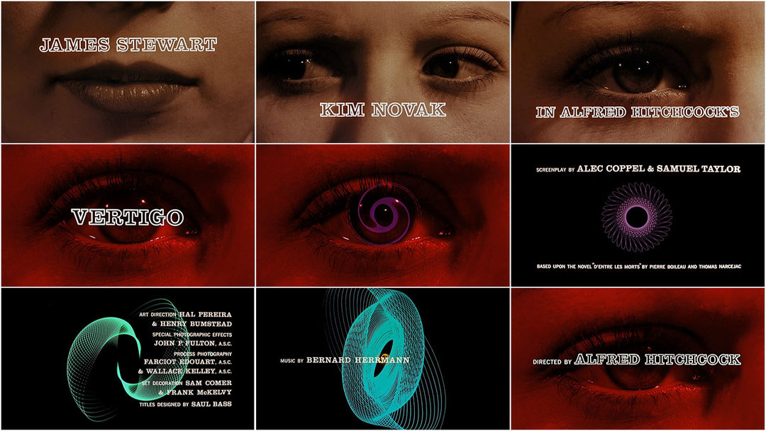
Cape Fear

The title sequence for the 1991 film Cape Fear Dir(Martin Scorsese) was designed by the graphic designer Saul Bass, he is well known for his geometric shapes and use of bold colours,
This title sequence follows the codes and conventions of thriller genre. The first scene opens on a river current with a reflection of an eagle, eagles are represented as predators and hunt by themselves for prey this suggests foreshadowing as in the film there may be a innocent be attacked by a predator.

As the sequence goes on we see an extreme close up of an eye this shot is effective because it makes the audience feel very uncomfortable. We also a silhouette of a man which hints the narrative of the film. There is a complete change of colour when we see red dipping into the water then the whole screen changes red which symbolizes danger and anger which also links back to the narrative.

The sound track is fast at first then gets slower creating a sense of panic and suspense.The music is played throughout the whole sequence. The music is very effective on creating the mood of the film as it sets a creepy and manic atmosphere.

The typography flows with the rivers current but the font is also sharp and aggressive which fits with the thriller genre.


Sunday 27 March 2016

Forrest Gump


The 1994 film Forrest Gump dir.(Robert Zemeckis). The title sequence for this is film is about fate and where is takes us. A feather is what the camera follows as we see the feather blowing in the wind the feather is quite significant in the sequence as the feather lands at forrests feet who is the protagnist. The feather falls soft and smoothly which goes with the soundtrack which is a relaxing melody. The music sets the mood and atmosphere of the movie. We see the towns scenery through wide shots when the feather lands at Forrest feet we get medium close ups of the feather but mostly of Forrest.

Audience Profile

Journal


We researched music to go with our title sequence because our genre is thriller we are going to need a slow and eerie soundtrack to create a creepy atmosphere.
As a group we decided to add an audio to our sequence influence from the Gone Girl sequence. We choose to have one of our group member to say a few sentences from the Brothers Grimm story Hansel and Gretel as it links to our narrative of the missing boy this is effective because it adds suspense and tension towards the audience.


Filming Journal


Today we are going to start filming road signs to symbolize the protagonist journey of reopening and searching for her brother. We filmed these during school time so we had permission to go out and film. We made our way to Bexleyheath and filmed road signs such as arrows and location names. We also found a map which links to the sequence so i filmed an extreme close up of it.

Filming Journal 2


We all met at 12:00 am at the Bexleyheath clock tower then we made our way to Surpiyas house to start shooting our title sequence. We shot it in the garden shed as it was big enough to look like an attic, We shot the sequence in order to the protagonist first opening the door and making her way to the evidence box and searching through the contents.
We used different shots such as the over the shoulder, close up and medium long shot.
After shooting the scenes we moved onto shooting the montage of the protagonist replacing the old missing poster to the new one.

Friday 25 March 2016

Thriller Codes and Conventions

Codes and Conventions of Thriller

The aim of thriller is to create suspense and excitement for the audience.
A thriller normally consists of a battle between the protagonist and antagonist, the story usually shows a chain of bad events building tension and suspense for the climax. The Thriller film often uses the busy streets and environments of is usually urban or suburban areas.

Conventions of a Thriller

Quick cuts
Low key cuts
Changes in the angle of shots
Tension music
Black and white shots
Montage of shots
Shadows
Close up shots

In Thriller the protagonist is often a brave male who seeks to restore equilibrium.
The antagonist will have a hidden identity to create mystery, but will uncover as the film carry's on.

In thriller there are a lot of close ups and extreme close ups of the protagonist, this is often to show their emotions, also it can be used to focus on the props which links to the narrative.
The shots of the antagonist will be quick shots to hide the identity, low lighting , silhouette or the shadow can also create creepiness and mystery towards the antagonist.

Music is essential to understand and set the mood of the film. In thriller it adds suspense and tension. It will usually start as a slow pace and then build up to make shots more dramatic for the audience.


Thursday 24 March 2016

Journal-Feedback


On our feedback we was told that the shots we filmed looked quiet dull because we decreased the brightness and played with the saturation and highlight we done this because we filmed the scenes on a sunny day so the shots were bright which doesn't really go with the codes and conventions of thriller as it needs to be dark and eerie. The typography also didn't really go with the scenes as it being really dark then the shots being dull it didn't look very appealing. So overall we decided to re shoot the scenes.

Stop Motion typography


This is the first draft of our stop motion, we created this by writing the name of the actor then taking a picture of every step on opening the paper making sure to take a photograph of every step then we imported it onto the computer and added all the photographs onto final cut pro then changed the duration to make it faster so it flows better. This draft needs to be speed up because in the middle of the motion is drags on for some time.
The set up onto creating this was placing the paper onto a black sheet of paper and having a spot light slighting facing onto the writing. On final cut pro we darkened the shots and increased the highlight.

Journal-Production name


Our production name was created using final cut pro. This will be placed at the start of our title sequence. SSBC productions, this name is created by having the first letter of our names which creates SSBC We wanted it to be associated with the thriller genre so we choose to do it in a typewriter style, typewriters are associated with thrillers because they are mainly set in time when they are used then actual computers so everything like documents and reports in investigations are written on typewriters. We found a typewriter font from Dafonts called 'Moms Typewriter' then searched for sounds of a typewriter.


 Typewriter Sound Effect - https://youtu.be/VP2WctM2tzU


First draft of Title sequence


This is the first draft of our title sequence.

Pitch


Storyboard

Wednesday 16 March 2016

Danny Yount


Me and my group made a presentation on prezi about the graphic designer Danny Yount to present to my class.
https://prezi.com/mnxtrgzo_3fd/copy-of-danny-yount/


Journal


We created a montage of news reports explaining the narrative of the sequence. We done this by finding news reports of missing children and cutting them to make it sound like one sentence explaining where the toddler is missing.

Research Typography


These fonts all have a lot in common with each other. The typography is simple but bold, it stands out from the background even if it has an image it still draws the attention of the audience.The colour schemes across the thriller genre use the colours such as red, white and black. They stand out and have connotations of danger and blood. Some thriller fonts like cape fear can be distorted this is common as it has connotations of mystery and can sometimes be a metaphor or represent a character of the narrative of the film.


As a group we decided that the typography for the title sequence would be in a handwritten like font. We choose this as it links to the narrative of the missing boy so we will have the writing in a childlike font to represent the boy or the font to be written by the protagonist so her handwriting would be joined up but also quick and scruffy.
We took influence of the typography from David Flinches film Se7en as in the sequence it looks like the font is a handwritten by the antagonist himself it also metaphors him being childlike and manic with the handwriting font being scruffy and not very neat.


Tuesday 15 March 2016

Journal


We have finished the first edit of our title sequence I've uploaded it to YouTube to add onto my blog. We still have some improvements to be made but this was just a first draft to show to our peers for feedback. This will also give us more ideas to improve our sequence and overall better our final edit.

Thursday 10 March 2016

Typography


As a group we decided to have our title names to be a handwritten font as it links with the sequence. We decided to have it actually written then having done on computer as it looks more authentic. We wrote on the paper of the producers and actors and scrunched the paper to make it look more rough amd effective, then we scanned it onto the computer to add into final cut pro. We initially decided to have the names just appearing on to the screen with a black background. But we then had the idea of using stop-motion. To create stop motion we took photographs of the paper opening up in stages. Once we done evryname they were imported into final cut pro and put all together , we had to change the duration to make it quicker and it makes it overall look better fast.
When it was imported to final cut pro we chnaged the highlight and brightness to make it darker as it looks more errie.

Detective Card (prop)


This is the detectives business card we are going to use for our title sequence this is going to be in the shot when our protagonist opens the evidence box to show who was apart of the missing boy investigation This was made from photoshop, we also laminated it once it was printed so it looks more legit.

Thursday 3 March 2016

Lord of war


The 2005 film Lord of war dir.(Andrew Niccol). In the beginning the camera starts at a high angle then drops down to show the environment of the factory and the workers with machinery. After the creation of the bullet, the camera is attached to the bullet as it takes you on the journey of a bullet to being distributed and used. This creates a sense of audience engagement, the audience becomes the bullet and we are able to see the journey from the most intimate perspective.
When the bullet is spinning round until its picked up just before falling over the edge of the dock the camera remains in first persons throughout.
The sequence takes us from the birth of a bullet and its expedition to reach its purpose which is almost like the circle of life.


Missing boy poster


This is one of the props that we made on photoshop for our title sequence. We made this because its gives the audience an insight on what the film is about and shows who's missing.

Sunday 14 February 2016

Catch me if you can


The 2002 film Catch me if you can Dir.(Steven Spielberg) This title sequence was inspired by Saul Bass who uses geometric shapes to create narrative.

This animated title sequence establishes the main character, narrative and a brief understanding of the setting. The title sequence uses a creative way to connect the the typography and animation together as one. Throughout the sequence we see a man who seems like hes trying to hide from someone or something which gives a small hint on the plot of the film. The character acts slyly and smooth whenever he changes locations and disguise, the character always seems to look back for a few seconds till hes on the move again we see him getting chased by someone . The music changes to a faster pace and more dramatic when getting chased which builds suspense and links to the film title 'Catch me if you can' .


Monday 8 February 2016

The Art Of Title Design Throughout Cinema History


The Art Of Film Title Design Throughout Cinema History


Film titles and letter cards had to provide essential information to the viewer. For reasons such as ease of production and clarity, artists favored mono-stroke letterforms or characters with small serifs. White lettering on a black background is another characteristic of this era, because titles simply looked better this way when projected with live-action B&W film.

Words and lettering played an enormous role in films of the silent era. Film titles made their appearance in the earliest silent films, along with letter cards (or inter-titles), which provided context. These cards were the responsibility of the lettering artist, who collaborated with the scriptwriter and director to create narrative continuity so that audiences could follow what they were seeing. Distinct from these inter-titles was the film’s main title, a vehicle of particular concern to film producers because of the legal, copyright and marketing information this footage had to bear.


In addition to hiring lettering artists, the biggest film studios began to employ typesetters in the production of title cards. Among the fonts often adopted for titles and inter-title cards were Pastel (BB&S, 1892), National Old Style (ATF, 1916) and Photoplay (Samuel Welo’s Studio, 1927).

In addition to hiring lettering artists, the biggest film studios began to employ typesetters in the production of title cards. Among the fonts often adopted for titles and inter-title cards were Pastel (BB&S, 1892), National Old Style (ATF, 1916) and Photoplay (Samuel Welo’s Studio, 1927).


https://www.smashingmagazine.com/2010/10/the-art-of-the-film-title-throughout-cinema-history/

Love Actually


Love Actually 

The 2003 film Love actually dir.(Richard Curtis) The title sequence for this film uses soft music which is non digetic to set the feel and genre of the film. This film is a hybrid genre of romance and comedy which is well know as rom-com.

Knowing that this film is about love we expect it to be like other rom coms, they are mainly targeted at females as they aspire for relationships as in the films. But with this title sequence it also shows love between family members not just couples. This shows that that the film will cover a wide range of love rather then just your typically boy meets girl rom com.

The scene begins with a shot of an overcrowded airport which shows a plane has landed and people are reuniting with their loved ones. We also see a shot of a family meeting at the airport, the camera then zooms up on their faces to see there reactions of being together this suggests that the film is also about love and being together. Throughout the sequence it shows other families and couples showing affection after a few seconds we start to hear a non-digect audio voice over talking about love which also sets the tone and theme of the film.The use of slow motion gives an emotional feel and gives the audience time to focus on the peoples faces and their expressions.


Sunday 7 February 2016

The Incredible Hulk


This title sequence was designed by Kyle Cooper for the 2008 film The Incredible Hulk dir.(Louis Letterier) Throughout the title sequence it tells the origin of hulk through montages and flashbacks from the previous films this gives the audience information about the backstory so they know whats going in the film, The montage scenes with the newspaper cutting also gives us an insight on what happened during the last film. In the sequence it shows us the the hulks point of view which gives the audience the chance to see what its like being the hulk himself,

The colour theme throughout the title sequence is green, the typography is the colour green which represents the hulk, with this it is easily makes the audience relate the colour green with the hulk throughout the sequence. The text was placed in the middle of the screen which gets the audience to focus on the text, the text also comes at a fast pace which goes with the sequence overall.

The use of filters such as when its in the hulks point of view it shows that hes disoriented and angry this is shown by having a fuzzy and shaken effect on the screen.

The music throughout the sequence is fast paced which is well edited with the shots which makes the sequence flow.


Saturday 6 February 2016

Vertigo


Vertigo

The 1998 film Vertigo dir.(Alfred Hitchcock), the designer for the title sequence was created by Saul Bass, Bass is know for his geometric shapes and unique style of shapes used to tell a story through title sequences and posters for films.

This title sequence is split into two sections the first bit directed by Hitchcock. The close up shot of the woman is effective on making the audience uncomfortable and quite claustrophobic, it makes you feel that there is no personal space between you and the character. With the opening credits of the main actors names on the parts of the woman's face keeps the audience looking at the screen. When the screen changes to a red filter this could represent danger and fear along with the protagonists eyes widening in terror.

The second section of the title sequence was created by Saul Bass. This is where the graphic geometric shapes appear on the screen. The shapes appear repetitively which represents the themes of the film: confusion, fear and obsession.


Wednesday 3 February 2016

Genre

Napoleon Dynamite

This title sequence tells us that the film is an american high school comedy film as it first shows in the wallet ID of a teenage boy, as it carries on we consistently see meals of what teenagers would eat throughout the day after the meals it shows library books which also shows us that the film is going to be based around school. The colours in the title sequence are bright and bold which shows that the film is going to be comedy which then the audience is targeted at teens and up.


The Back Up Plan-

The title sequence for The Back Up Plan is a hybrid genre of comedy and romance which is called a rom-com. The sequence is animated which creates a fun feel towards the audience it uses bright colours which also shows that its going to be a comedy. The main character is a women, as she's walking the location constantly changes to shopping windows. These features throughout the sequence shows the audience that its a targeted along with the use of feminine typography to a female audience.

Dr no (James bond)-

This film is an action film with the sub genre of a spy film. The title sequence uses silhouettes which creates a mysterious look and gets the audience thinking on what the film is about. The bullet barrel then suggests that then its an action film.


Lemony Snickets Unfortunate Events -

This title sequence gives off an gothic feel with the use of dark colours and illustrations, give a creepy and scary look but with the three children coming up as the protagonist suggests that the film is also a family film, the locations throughout the sequence shows that its adventure as we see the three kids in unrealistic situations so the genre being a family gothic film.

Napoleon Dynamite-

The genre of this film is a comedy. You can tell because of the high key lighting and bold colours which creates a happy atmosphere. The titles being made out of food and other subjects tells us that its going to be a light hearten film. We can tell the sub genre of this film is going to be about a american high school as it shows us objects such as library cards and school stationary.

Wednesday 27 January 2016

Saul Bass

Saul Bass


Saul Bass was an American graphic designer who became famous for his title sequences.
He is best known for his use of simple geometric shapes and symbolism he often created a single dominate image to stand alone to convey an influential message.
Bass started out designing posters; he was able to capture the mood of the film with simple shapes and images. He preferred this technique then using dull photographs from the film or using the film stars. 
Bass's work is often hand drawn to create a casual appearance and unique look.


Bass worked for some of Hollywood’s greatest filmmakers, including Alfred Hitchcock, Stanley Kubrick, Otto Preminger, Billy Wilder, and Martin Scorsese. He became well-known in the film industry after creating the title sequence for Otto Preminger’s The Man with the Golden Arm in 1955. For Alfred Hitchcock.

“I began as a graphic designer and as part of my work I created
many film symbols for ad campaigns. During that period I happened to be working on the symbols for ‘Carmen Jones’ and ‘The man with the golden arm’ for Otto Preminger. At one point in our work Otto and I just looked at
each other and said: “why not make it move?” It was really as simple as that.”


— SAUL BASS – “Bass on titles,” 1977


Se7en


     Kyle Cooper created the title sequence for the 1995 film Se7en dir (David Flincher), he              changed the whole movement of title sequences and influenced many other graphic                      designers when it was released. Cooper sets the mood of the film straight away with the              gritty and eerie music which emphasizes the thriller genre.

     The close up shots creates a claustrophobic feel to make the audience uncomfortable but also        forces them to look at the smaller details on the screen and what you wouldn't necessarily            look at also on what the character is doing such as what hes highlighting, titles of                
     newspapers and photographs. It also makes the audience think on who the character is, what        hes doing and why hes doing it.


The close up of the dirty hands shows that he does a lot of manual work as which also makes the audience uncomfortable as the character is using a razor to peel of the skin which isn't classed as a normal thing to do. Also when the perpetrator is suing the book it also makes the viewers fear the needles and reminds them of stitches. The props are books, journals and files which can be associated with investigation and detectives which gives the audience on what the film could be about.
The colours are neutral such as black and white but when it goes further into the sequence bits of red show up and when photographs are getting developed in a dark room which means he had taken them himself. The colour red also represents danger and power.
The font in the sequence when showing the actors names is childlike which can represent the perpetrator with mental disabilities to show an innocent side of the character but with it being shaky it also represents his manic and unbalanced mind.


 OCR
Preliminary exercise: Continuity task involving filming and editing a character opening a door, crossing a room and sitting down in a chair opposite another character, with whom she/he then exchanges a couple of lines of dialogue. This task should demonstrate match on action, shot/reverse shot and the 180-degree rule.

Main task: the titles and opening of a new fiction film, to last a maximum of two minutes.

All video and audio material must be original, produced by the candidate(s), with the exception of music or audio effects from a copyright-free source. Both preliminary and main tasks may be done individually or as a group. Maximum four members to a group.

Wednesday 13 January 2016

Continuity Sequence


This is Short clip has match on action , shot reverse shot and 180 degree shot. To improve this clip we could of had the camera in focus more and have the camera not so shaky