Thursday 31 March 2016

Analysis of sequences following codes and conventions


The Machinist

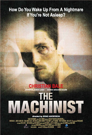
The title sequence of the 2005 film The Machinist Dir( Brad Anderson) follows the codes and conventions of the thriller genre. At the beginning of the sequence we see a black screen with the text of the film company but we hear the sound of a pant or someone struggling to breathe this already makes to the audience uneasy as they don't know where its coming from or who it actually is.

The soundtrack is mainly digetic in the sequence, the music is ominous and creepy which creates a thriller atmosphere. Danger is foreshadowed as there are digetic police sirens playing at the beginning of the scene.
As the audience we are watching the protagonist through a window this suggests that we are seeing it from a persons point of view, as it seems like he doesn't know that someones watching him.
Low key lightning is used throughout which creates heavy shadows also shows us the facial expression of the protaganist which makes his face look more creepy.
The sequence is overall slow paced this makes us look at whats going and pay attention to every detail

Cape Fear

The title sequence for the 1991 film Cape Fear Dir(Martin Scorsese) was designed by the graphic designer Saul Bass, he is well known for his geometric shapes and use of bold colours,
This title sequence follows the codes and conventions of thriller genre. The first scene opens on a river current with a reflection of an eagle, eagles are represented as predators and hunt by themselves for prey this suggests foreshadowing as in the film there may be a innocent be attacked by a predator.

As the sequence goes on we see an extreme close up of an eye this shot is effective because it makes the audience feel very uncomfortable. We also a silhouette of a man which hints the narrative of the film. There is a complete change of colour when we see red dipping into the water then the whole screen changes red which symbolizes danger and anger which also links back to the narrative.

The sound track is fast at first then gets slower creating a sense of panic and suspense.The music is played throughout the whole sequence. The music is very effective on creating the mood of the film as it sets a creepy and manic atmosphere.

The typography flows with the rivers current but the font is also sharp and aggressive which fits with the thriller genre.

Sunday 27 March 2016

Forrest Gump


The 1994 film Forrest Gump dir.(Robert Zemeckis). The title sequence for this is film is about fate and where is takes us. A feather is what the camera follows as we see the feather blowing in the wind the feather is quite significant in the sequence as the feather lands at forrests feet who is the protagnist. The feather falls soft and smoothly which goes with the soundtrack which is a relaxing melody. The music sets the mood and atmosphere of the movie. We see the towns scenery through wide shots when the feather lands at Forrest feet we get medium close ups of the feather but mostly of Forrest.

Audience Profile

Journal


We researched music to go with our title sequence because our genre is thriller we are going to need a slow and eerie soundtrack to create a creepy atmosphere.
As a group we decided to add an audio to our sequence influence from the Gone Girl sequence. We choose to have one of our group member to say a few sentences from the Brothers Grimm story Hansel and Gretel as it links to our narrative of the missing boy this is effective because it adds suspense and tension towards the audience.


Filming Journal


Today we are going to start filming road signs to symbolize the protagonist journey of reopening and searching for her brother. We filmed these during school time so we had permission to go out and film. We made our way to Bexleyheath and filmed road signs such as arrows and location names. We also found a map which links to the sequence so i filmed an extreme close up of it.

Filming Journal 2


We all met at 12:00 am at the Bexleyheath clock tower then we made our way to Surpiyas house to start shooting our title sequence. We shot it in the garden shed as it was big enough to look like an attic, We shot the sequence in order to the protagonist first opening the door and making her way to the evidence box and searching through the contents.
We used different shots such as the over the shoulder, close up and medium long shot.
After shooting the scenes we moved onto shooting the montage of the protagonist replacing the old missing poster to the new one.

Friday 25 March 2016

Thriller Codes and Conventions

Codes and Conventions of Thriller

The aim of thriller is to create suspense and excitement for the audience.
A thriller normally consists of a battle between the protagonist and antagonist, the story usually shows a chain of bad events building tension and suspense for the climax. The Thriller film often uses the busy streets and environments of is usually urban or suburban areas.

Conventions of a Thriller

Quick cuts
Low key cuts
Changes in the angle of shots
Tension music
Black and white shots
Montage of shots
Shadows
Close up shots

In Thriller the protagonist is often a brave male who seeks to restore equilibrium.
The antagonist will have a hidden identity to create mystery, but will uncover as the film carry's on.

In thriller there are a lot of close ups and extreme close ups of the protagonist, this is often to show their emotions, also it can be used to focus on the props which links to the narrative.
The shots of the antagonist will be quick shots to hide the identity, low lighting , silhouette or the shadow can also create creepiness and mystery towards the antagonist.

Music is essential to understand and set the mood of the film. In thriller it adds suspense and tension. It will usually start as a slow pace and then build up to make shots more dramatic for the audience.


Thursday 24 March 2016

Journal-Feedback


On our feedback we was told that the shots we filmed looked quiet dull because we decreased the brightness and played with the saturation and highlight we done this because we filmed the scenes on a sunny day so the shots were bright which doesn't really go with the codes and conventions of thriller as it needs to be dark and eerie. The typography also didn't really go with the scenes as it being really dark then the shots being dull it didn't look very appealing. So overall we decided to re shoot the scenes.

Stop Motion typography


This is the first draft of our stop motion, we created this by writing the name of the actor then taking a picture of every step on opening the paper making sure to take a photograph of every step then we imported it onto the computer and added all the photographs onto final cut pro then changed the duration to make it faster so it flows better. This draft needs to be speed up because in the middle of the motion is drags on for some time.
The set up onto creating this was placing the paper onto a black sheet of paper and having a spot light slighting facing onto the writing. On final cut pro we darkened the shots and increased the highlight.

Journal-Production name


Our production name was created using final cut pro. This will be placed at the start of our title sequence. SSBC productions, this name is created by having the first letter of our names which creates SSBC We wanted it to be associated with the thriller genre so we choose to do it in a typewriter style, typewriters are associated with thrillers because they are mainly set in time when they are used then actual computers so everything like documents and reports in investigations are written on typewriters. We found a typewriter font from Dafonts called 'Moms Typewriter' then searched for sounds of a typewriter.


 Typewriter Sound Effect - https://youtu.be/VP2WctM2tzU


First draft of Title sequence


This is the first draft of our title sequence.

Pitch


Storyboard

Wednesday 16 March 2016

Danny Yount


Me and my group made a presentation on prezi about the graphic designer Danny Yount to present to my class.
https://prezi.com/mnxtrgzo_3fd/copy-of-danny-yount/


Journal


We created a montage of news reports explaining the narrative of the sequence. We done this by finding news reports of missing children and cutting them to make it sound like one sentence explaining where the toddler is missing.

Research Typography


These fonts all have a lot in common with each other. The typography is simple but bold, it stands out from the background even if it has an image it still draws the attention of the audience.The colour schemes across the thriller genre use the colours such as red, white and black. They stand out and have connotations of danger and blood. Some thriller fonts like cape fear can be distorted this is common as it has connotations of mystery and can sometimes be a metaphor or represent a character of the narrative of the film.


As a group we decided that the typography for the title sequence would be in a handwritten like font. We choose this as it links to the narrative of the missing boy so we will have the writing in a childlike font to represent the boy or the font to be written by the protagonist so her handwriting would be joined up but also quick and scruffy.
We took influence of the typography from David Flinches film Se7en as in the sequence it looks like the font is a handwritten by the antagonist himself it also metaphors him being childlike and manic with the handwriting font being scruffy and not very neat.


Tuesday 15 March 2016

Journal


We have finished the first edit of our title sequence I've uploaded it to YouTube to add onto my blog. We still have some improvements to be made but this was just a first draft to show to our peers for feedback. This will also give us more ideas to improve our sequence and overall better our final edit.

Thursday 10 March 2016

Typography


As a group we decided to have our title names to be a handwritten font as it links with the sequence. We decided to have it actually written then having done on computer as it looks more authentic. We wrote on the paper of the producers and actors and scrunched the paper to make it look more rough amd effective, then we scanned it onto the computer to add into final cut pro. We initially decided to have the names just appearing on to the screen with a black background. But we then had the idea of using stop-motion. To create stop motion we took photographs of the paper opening up in stages. Once we done evryname they were imported into final cut pro and put all together , we had to change the duration to make it quicker and it makes it overall look better fast.
When it was imported to final cut pro we chnaged the highlight and brightness to make it darker as it looks more errie.

Detective Card (prop)


This is the detectives business card we are going to use for our title sequence this is going to be in the shot when our protagonist opens the evidence box to show who was apart of the missing boy investigation This was made from photoshop, we also laminated it once it was printed so it looks more legit.

Thursday 3 March 2016

Lord of war


The 2005 film Lord of war dir.(Andrew Niccol). In the beginning the camera starts at a high angle then drops down to show the environment of the factory and the workers with machinery. After the creation of the bullet, the camera is attached to the bullet as it takes you on the journey of a bullet to being distributed and used. This creates a sense of audience engagement, the audience becomes the bullet and we are able to see the journey from the most intimate perspective.
When the bullet is spinning round until its picked up just before falling over the edge of the dock the camera remains in first persons throughout.
The sequence takes us from the birth of a bullet and its expedition to reach its purpose which is almost like the circle of life.


Missing boy poster


This is one of the props that we made on photoshop for our title sequence. We made this because its gives the audience an insight on what the film is about and shows who's missing.