Showing posts with label Title Analysis. Show all posts

Sunday, 27 March 2016

Forrest Gump


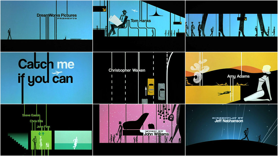
The 1994 film Forrest Gump dir.(Robert Zemeckis). The title sequence for this is film is about fate and where is takes us. A feather is what the camera follows as we see the feather blowing in the wind the feather is quite significant in the sequence as the feather lands at forrests feet who is the protagnist. The feather falls soft and smoothly which goes with the soundtrack which is a relaxing melody. The music sets the mood and atmosphere of the movie. We see the towns scenery through wide shots when the feather lands at Forrest feet we get medium close ups of the feather but mostly of Forrest.

Thursday, 3 March 2016

Lord of war


The 2005 film Lord of war dir.(Andrew Niccol). In the beginning the camera starts at a high angle then drops down to show the environment of the factory and the workers with machinery. After the creation of the bullet, the camera is attached to the bullet as it takes you on the journey of a bullet to being distributed and used. This creates a sense of audience engagement, the audience becomes the bullet and we are able to see the journey from the most intimate perspective.
When the bullet is spinning round until its picked up just before falling over the edge of the dock the camera remains in first persons throughout.
The sequence takes us from the birth of a bullet and its expedition to reach its purpose which is almost like the circle of life.


Sunday, 14 February 2016

Catch me if you can


The 2002 film Catch me if you can Dir.(Steven Spielberg) This title sequence was inspired by Saul Bass who uses geometric shapes to create narrative.

This animated title sequence establishes the main character, narrative and a brief understanding of the setting. The title sequence uses a creative way to connect the the typography and animation together as one. Throughout the sequence we see a man who seems like hes trying to hide from someone or something which gives a small hint on the plot of the film. The character acts slyly and smooth whenever he changes locations and disguise, the character always seems to look back for a few seconds till hes on the move again we see him getting chased by someone . The music changes to a faster pace and more dramatic when getting chased which builds suspense and links to the film title 'Catch me if you can' .


Monday, 8 February 2016

Love Actually


Love Actually 

The 2003 film Love actually dir.(Richard Curtis) The title sequence for this film uses soft music which is non digetic to set the feel and genre of the film. This film is a hybrid genre of romance and comedy which is well know as rom-com.

Knowing that this film is about love we expect it to be like other rom coms, they are mainly targeted at females as they aspire for relationships as in the films. But with this title sequence it also shows love between family members not just couples. This shows that that the film will cover a wide range of love rather then just your typically boy meets girl rom com.

The scene begins with a shot of an overcrowded airport which shows a plane has landed and people are reuniting with their loved ones. We also see a shot of a family meeting at the airport, the camera then zooms up on their faces to see there reactions of being together this suggests that the film is also about love and being together. Throughout the sequence it shows other families and couples showing affection after a few seconds we start to hear a non-digect audio voice over talking about love which also sets the tone and theme of the film.The use of slow motion gives an emotional feel and gives the audience time to focus on the peoples faces and their expressions.


Sunday, 7 February 2016

The Incredible Hulk


This title sequence was designed by Kyle Cooper for the 2008 film The Incredible Hulk dir.(Louis Letterier) Throughout the title sequence it tells the origin of hulk through montages and flashbacks from the previous films this gives the audience information about the backstory so they know whats going in the film, The montage scenes with the newspaper cutting also gives us an insight on what happened during the last film. In the sequence it shows us the the hulks point of view which gives the audience the chance to see what its like being the hulk himself,

The colour theme throughout the title sequence is green, the typography is the colour green which represents the hulk, with this it is easily makes the audience relate the colour green with the hulk throughout the sequence. The text was placed in the middle of the screen which gets the audience to focus on the text, the text also comes at a fast pace which goes with the sequence overall.

The use of filters such as when its in the hulks point of view it shows that hes disoriented and angry this is shown by having a fuzzy and shaken effect on the screen.

The music throughout the sequence is fast paced which is well edited with the shots which makes the sequence flow.


Saturday, 6 February 2016

Vertigo


Vertigo

The 1998 film Vertigo dir.(Alfred Hitchcock), the designer for the title sequence was created by Saul Bass, Bass is know for his geometric shapes and unique style of shapes used to tell a story through title sequences and posters for films.

This title sequence is split into two sections the first bit directed by Hitchcock. The close up shot of the woman is effective on making the audience uncomfortable and quite claustrophobic, it makes you feel that there is no personal space between you and the character. With the opening credits of the main actors names on the parts of the woman's face keeps the audience looking at the screen. When the screen changes to a red filter this could represent danger and fear along with the protagonists eyes widening in terror.

The second section of the title sequence was created by Saul Bass. This is where the graphic geometric shapes appear on the screen. The shapes appear repetitively which represents the themes of the film: confusion, fear and obsession.


Wednesday, 3 February 2016

Genre

Napoleon Dynamite

This title sequence tells us that the film is an american high school comedy film as it first shows in the wallet ID of a teenage boy, as it carries on we consistently see meals of what teenagers would eat throughout the day after the meals it shows library books which also shows us that the film is going to be based around school. The colours in the title sequence are bright and bold which shows that the film is going to be comedy which then the audience is targeted at teens and up.


The Back Up Plan-

The title sequence for The Back Up Plan is a hybrid genre of comedy and romance which is called a rom-com. The sequence is animated which creates a fun feel towards the audience it uses bright colours which also shows that its going to be a comedy. The main character is a women, as she's walking the location constantly changes to shopping windows. These features throughout the sequence shows the audience that its a targeted along with the use of feminine typography to a female audience.

Dr no (James bond)-

This film is an action film with the sub genre of a spy film. The title sequence uses silhouettes which creates a mysterious look and gets the audience thinking on what the film is about. The bullet barrel then suggests that then its an action film.


Lemony Snickets Unfortunate Events -

This title sequence gives off an gothic feel with the use of dark colours and illustrations, give a creepy and scary look but with the three children coming up as the protagonist suggests that the film is also a family film, the locations throughout the sequence shows that its adventure as we see the three kids in unrealistic situations so the genre being a family gothic film.

Napoleon Dynamite-

The genre of this film is a comedy. You can tell because of the high key lighting and bold colours which creates a happy atmosphere. The titles being made out of food and other subjects tells us that its going to be a light hearten film. We can tell the sub genre of this film is going to be about a american high school as it shows us objects such as library cards and school stationary.

Wednesday, 27 January 2016

Se7en


     Kyle Cooper created the title sequence for the 1995 film Se7en dir (David Flincher), he              changed the whole movement of title sequences and influenced many other graphic                      designers when it was released. Cooper sets the mood of the film straight away with the              gritty and eerie music which emphasizes the thriller genre.

     The close up shots creates a claustrophobic feel to make the audience uncomfortable but also        forces them to look at the smaller details on the screen and what you wouldn't necessarily            look at also on what the character is doing such as what hes highlighting, titles of                
     newspapers and photographs. It also makes the audience think on who the character is, what        hes doing and why hes doing it.


The close up of the dirty hands shows that he does a lot of manual work as which also makes the audience uncomfortable as the character is using a razor to peel of the skin which isn't classed as a normal thing to do. Also when the perpetrator is suing the book it also makes the viewers fear the needles and reminds them of stitches. The props are books, journals and files which can be associated with investigation and detectives which gives the audience on what the film could be about.
The colours are neutral such as black and white but when it goes further into the sequence bits of red show up and when photographs are getting developed in a dark room which means he had taken them himself. The colour red also represents danger and power.
The font in the sequence when showing the actors names is childlike which can represent the perpetrator with mental disabilities to show an innocent side of the character but with it being shaky it also represents his manic and unbalanced mind.