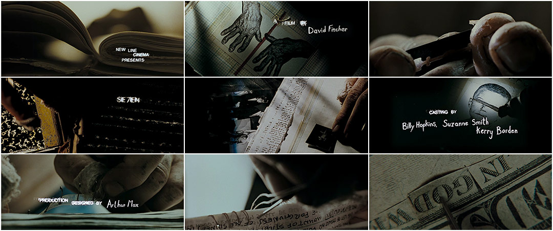
Kyle Cooper created the title sequence for the 1995 film Se7en dir (David Flincher), he changed the whole movement of title sequences and influenced many other graphic designers when it was released. Cooper sets the mood of the film straight away with the gritty and eerie music which emphasizes the thriller genre.
The close up shots creates a claustrophobic feel to make the audience uncomfortable but also forces them to look at the smaller details on the screen and what you wouldn't necessarily look at also on what the character is doing such as what hes highlighting, titles of
newspapers and photographs. It also makes the audience think on who the character is, what hes doing and why hes doing it.
The close up of the dirty hands shows that he does a lot of manual work as which also makes the audience uncomfortable as the character is using a razor to peel of the skin which isn't classed as a normal thing to do. Also when the perpetrator is suing the book it also makes the viewers fear the needles and reminds them of stitches. The props are books, journals and files which can be associated with investigation and detectives which gives the audience on what the film could be about.
The colours are neutral such as black and white but when it goes further into the sequence bits of red show up and when photographs are getting developed in a dark room which means he had taken them himself. The colour red also represents danger and power.
The font in the sequence when showing the actors names is childlike which can represent the perpetrator with mental disabilities to show an innocent side of the character but with it being shaky it also represents his manic and unbalanced mind.

No comments:
Post a Comment