Vertigo
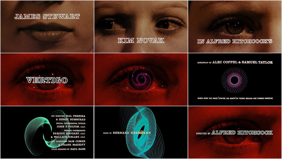
The 1998 film Vertigo dir.(Alfred Hitchcock), the designer for the title sequence was created by Saul Bass, Bass is know for his geometric shapes and unique style of shapes used to tell a story through title sequences and posters for films.
This title sequence is split into two sections the first bit directed by Hitchcock. The close up shot of the woman is effective on making the audience uncomfortable and quite claustrophobic, it makes you feel that there is no personal space between you and the character. With the opening credits of the main actors names on the parts of the woman's face keeps the audience looking at the screen. When the screen changes to a red filter this could represent danger and fear along with the protagonists eyes widening in terror.
The second section of the title sequence was created by Saul Bass. This is where the graphic geometric shapes appear on the screen. The shapes appear repetitively which represents the themes of the film: confusion, fear and obsession.

No comments:
Post a Comment